Hello and welcome to another blog post about SwiftUI. This years WWDC is approaching fast and the expectation of new SwiftUI features and/or changes is tremendous. So I have decided to dedicate this post to something lighter yet still playful.
I will share with you a simple way of creating a TikTok logo-ish effect but the main takeaway of this article is meant to be understanding how to create reusable styling for your app.
Start with blending of layers
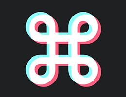
The key to creating our logo is in specific blending of two colored shapes. Please check the code first:
struct CommandLogoView: View {
    var body: some View {
        let logo = Image(systemName: "command")
            .font(.system(size: 200, weight: .bold, design: .default))

        return logo
            .foregroundColor(Color("tiktokRed"))
            .blendMode(.plusLighter)
            .overlay(
                logo
                    .foregroundColor(Color("tiktokBlue"))
                    .blendMode(.plusLighter)
                    .offset(CGSize(width: -4, height: -3))
            )
    }
}
As you see, I have used a simple SF Symbol as our logo. The resulting view takes this image, fills it with custom red color (defined in project assets) and as .overlay sets the same logo in blue, but slightly shifted with .offset viewModifier. The white area is the result of blend mode that is set to .plusLighter.

Take this example and try to experiment with the viewModifier parameters, especially .blendMode to see how it affects the result. For instance, if you wish to use your logo on white background, you may want to set it to .plusDarker instead
Wrap the effect as custom ViewModifier
We have achieved our logo with effect quite easily, but what if we need to apply the same effect to more elements in our app?
The beauty of SwiftUI is that you can specify custom ViewModifier and hide almost any of your styling into its implementation and thus gain the ability to reuse it anywhere.
My implementation looks like this:
struct TikTokEffect: ViewModifier {
    let offset: CGSize

    func negOffset()->CGSize {
        return CGSize(width: -self.offset.width, height: -self.offset.height)
    }

    func body(content: Content) -> some View {
        content
            .offset(self.negOffset())
            .foregroundColor(Color("tiktokRed"))
            .blendMode(.plusLighter)
            .overlay(
                content
                    .foregroundColor(Color("tiktokBlue"))
                    .blendMode(.plusLighter)
                    .offset(self.offset)
            )

    }
}
You can see that the overall structure derives from our first example, but it is no longer dependent on specific Image. Instead, the view modifier takes the Content that it has been applied to and sets the same content also as its overlay (but with a different color).
Also, the offset is prepared to be set as viewModifier parameter so it can be changed from the outside.
I have also introduced a negative offset here, that shifts the base content in the opposite direction to its overlay. With this improvement, the resulting view remains centered which I personaly prefer but it is optional change.
Our view modifier can be used like this to any kind of view, even the root view if you wish;)
Image(systemName: "command")
   .font(.system(size: 200, weight: .bold, design: .default))
   .modifier(TikTokEffect(offset: CGSize(width: -4, height: -3)))
Reuse view modifier within ButtonStyle
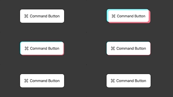
Custom view modifiers are especially handy when creating custom ButtonStyle, transitions, or animations. Let me share here an example of a button, that applies our effect when pressed:
struct TikTokButtonStyle: ButtonStyle {

    func backgroundShift(_ isPressed: Bool)->CGSize {
        if isPressed {
            return CGSize(width: -4, height: -3)
        }
        else {
            return CGSize()
        }
    }

    func makeBody(configuration: Self.Configuration) -> some View {
        configuration.label
            .padding(20)
            .background(
                RoundedRectangle(cornerRadius: 10, style: .continuous)
                    .modifier(TikTokEffect(offset: self.backgroundShift(configuration.isPressed)))
            )
            .scaleEffect(configuration.isPressed ? 0.95: 1)
            .foregroundColor(.black)
            .animation(.spring())
    }
}
Here we are changing the offset value of our effect based on configuration.isPressed value. The resulting button created as:
Button(action: {}) {
            HStack {
                Image(systemName: "command")
                Text("Command Button")
            }
        }
        .buttonStyle(TikTokButtonStyle())
now behaves like this:

Summary
- Styling the app and creating reusable styles can benefit heavily from custom view modifiers. This is only one of the many use-cases, but the same approach can be used for any app look and feel
- It is wise to keep configurable interface of your view modifier so it can be tuned for specific scenarios and foremost - ANIMATIONS. As an inspiration and your challenge, I present you a loading indicator based on our TikTokEffect. Can you achieve the same - or better?

Did you like this article? What do you want me to focus on next?
Feel free to comment or criticize so the next one is even better. Or share it with other SwiftUI adopters ;)
