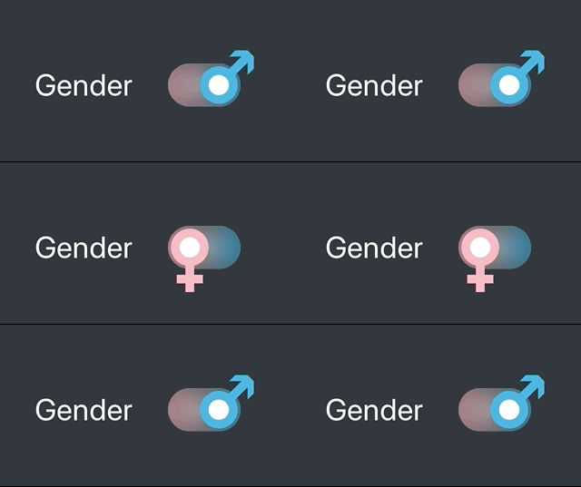
In my recent project, I have created custom toggle for baby gender selection. In this post, I would like to demonstrate, how to create such a custom view in SwiftUI and comment it in the order how I usually approach these things. But first, let’s have a look at what I am aiming for.

Start with Shape
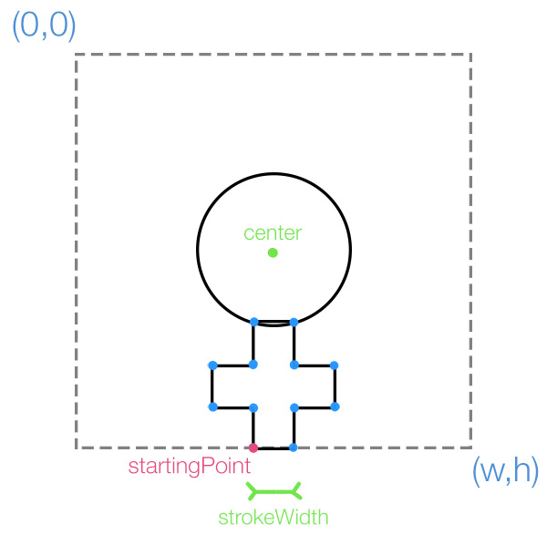
I usually start with the preparation of custom shapes and paths that will be later used in view composition. Drawing shapes using lines and arcs is pretty straightforward, you only need to be cautious about the point coordinates. I always prepare myself small shape annotation on the paper before I start coding.

The Venus shape implementation consists of one ellipse and a set of lines forming the cross below. Note that the center of the bounds is aligned with the center of the ellipse - we will benefit from this later when we will rotate the whole shape.
struct GenderShape: Shape {
    var stroke: CGFloat

    func path(in rect: CGRect) -> Path {
        return Path { path in
            let width = rect.width
            let height = rect.height
            let startx = (width-stroke)/2
            let circlePad = 3*stroke

            path.addEllipse(in: CGRect(x: circlePad, y: circlePad, width: width-2*circlePad, height: height-2*circlePad))

            path.move(to: CGPoint(x: startx, y: height)) // move to the bottom left point of the cross

            path.addLines([
                // left part
                CGPoint(x: startx, y: height-stroke+arrowShift),
                CGPoint(x: startx-stroke, y: height-stroke),
                CGPoint(x: startx-stroke, y: height-2*stroke),
                CGPoint(x: startx, y: height-2*stroke),
                CGPoint(x: startx, y: height-4*stroke),
                // right part
                CGPoint(x: startx+stroke, y: height-4*stroke),
                CGPoint(x: startx+stroke, y: height-2*stroke+arrowShift),
                CGPoint(x: startx+2*stroke, y: height-2*stroke),
                CGPoint(x: startx+2*stroke, y: height-stroke),
                CGPoint(x: startx+stroke, y: height-stroke),
                CGPoint(x: startx+stroke, y: height),

                // and close path
                CGPoint(x: startx, y: height)
            ])
        }
    }
}
Shape transformation
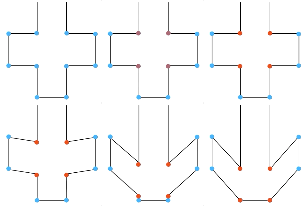
Having the basic shape ready, it is time to allow it to transform from the starting Venus symbol to the Mars symbol. Here I will make things easier for me and I will accomplish the transformation from cross to arrow just by moving 4 points like this.

Let’s add a new property called arroweness, that will control the position of transformed points and set it via animatableData property. This will allow SwiftUI to animate the shape whenever we change this property. We expect it to hold values from 0 to 1, where 0 corresponds to a cross symbol and 1 to an arrow symbol.
struct GenderShape: Shape {
    var arroweness: CGFloat// 0..1
    var stroke: CGFloat = 10

    var animatableData: CGFloat {
        get { arroweness }
        set { arroweness = newValue }
    }

    func path(in rect: CGRect) -> Path {
        return Path { path in
            let width = rect.width
            let height = rect.height
            let startx = (width-stroke)/2
            let circlePad = 3*stroke

            let arrowShift = arroweness*stroke // !!!

            path.addEllipse(in: CGRect(x: circlePad, y: circlePad, width: width-2*circlePad, height: height-2*circlePad))

            path.move(to: CGPoint(x: startx, y: height))

            path.addLines([
                // left
                CGPoint(x: startx, y: height-stroke+arrowShift), // !!!
                CGPoint(x: startx-stroke, y: height-stroke),
                CGPoint(x: startx-stroke, y: height-2*stroke),
                CGPoint(x: startx, y: height-2*stroke+arrowShift), // !!!
                CGPoint(x: startx, y: height-4*stroke),
                // right
                CGPoint(x: startx+stroke, y: height-4*stroke),
                CGPoint(x: startx+stroke, y: height-2*stroke+arrowShift), // !!!
                CGPoint(x: startx+2*stroke, y: height-2*stroke),
                CGPoint(x: startx+2*stroke, y: height-stroke),
                CGPoint(x: startx+stroke, y: height-stroke+arrowShift), // !!!
                CGPoint(x: startx+stroke, y: height),

                // and close
                CGPoint(x: startx, y: height)
            ])
        }
    }
}
View Composition
The final Toggle View is Composed from two main views stacked in ZStack:
- First, there is a rounded rectangle with gradiend overlay
- and on the top there is the gender shape overlayed with white circle, which will make the illusion of actual Toggle.
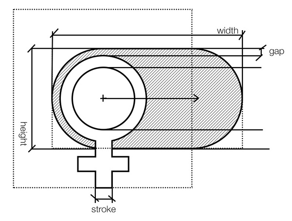
The code below contains several let constants holding diomensions of the view and subviews. It is ok since the Toggle control usually do not change its size. The meaning of constants is captured on the following diagram:

struct GenderToggle: View {

    let baseWidth: CGFloat = 50 // width of toggle
    let baseHeight: CGFloat = 30 // height of toggle
    let stroke: CGFloat = 6
    let gap: CGFloat = 2 // gap between the background and foreground

    var gradient = [Color("Pink"), Color.gray, Color("Blue")] // custom colors from assets

    var body: some View {
        let whiteButton = Circle()
                            .frame(width: baseHeight-2*gap - 2*stroke, height: baseHeight-2*gap - 2*stroke)
                            .foregroundColor(.white)
        let rectangleOverlay = RoundedRectangle(cornerRadius: baseHeight/2)
            .fill(RadialGradient(gradient: Gradient(colors: [Color.black.opacity(0), Color.black.opacity(0.2)]),
				center: UnitPoint(x: 0.5, y: 0.5), startRadius: 0, endRadius: baseWidth/2))
            .frame(width: baseWidth, height: baseHeight)

        return ZStack (){
            RoundedRectangle(cornerRadius: baseHeight/2)
                .fill(Color.secondary.opacity(0.5))
                .frame(width: baseWidth, height: baseHeight)
                .overlay(rectangleOverlay) // add color gradient over background

            GenderShape(arroweness: 0.0, stroke: stroke)
                .frame(width: baseHeight+6*stroke-2*gap, height: baseHeight+6*stroke-2*gap)
                .overlay(whiteButton)

        }
        .frame(width: baseWidth, height: baseHeight)
    }
}
State switching
By default, both the views are centered along the y-axis. To implement the state switch and changing animation we need to do the following:
- add property
genderthat will hold the state and can be linked to our model via@Binding - change
ycoordinate of foreground arrow based on thegendervalue - change our arroweness, rotation and color of gender symbol based on the
gendervalue - add tap gesture recognizer to perform the
genderswitch
The final code:
enum Gender : Int, Codable{
    case boy
    case girl
}

struct GenderToggle: View {
    @Binding var gender: Gender

    let baseWidth: CGFloat = 50 // width of toggle
    let baseHeight: CGFloat = 30 // height of toggle
    let stroke: CGFloat = 6
    let gap: CGFloat = 2 // gap between the background and foreground

    var gradient = [Color("Pink"), Color.gray, Color("Blue")] // custom colors from assets

    var body: some View {
        let whiteButton = Circle()
                            .frame(width: baseHeight-2*gap - 2*stroke, height: baseHeight-2*gap - 2*stroke)
                            .offset(CGSize(width:gender == .boy ? 10 : -10, height:0))
                            .foregroundColor(.white)
        let rectangleOverlay = RoundedRectangle(cornerRadius: baseHeight/2)
            .fill(RadialGradient(gradient: Gradient(colors: [Color.black.opacity(0), Color.black.opacity(0.2)]),
				center: UnitPoint(x: 0.5, y: 0.5), startRadius: 0, endRadius: baseWidth/2))
            .frame(width: baseWidth, height: baseHeight)

        return ZStack (){
            RoundedRectangle(cornerRadius: baseHeight/2)
                .fill(Color.secondary.opacity(0.5))
                .frame(width: baseWidth, height: baseHeight)
                .overlay(rectangleOverlay) // add color gradient over background

            GenderShape(arroweness:  gender == .boy ? 1.0 : 0.0, stroke: stroke)
                .frame(width: baseHeight+6*stroke-2*gap, height: baseHeight+6*stroke-2*gap)
                .rotationEffect(Angle(degrees: gender == .boy ? -135 : 0))
                .offset(CGSize(width:gender == .boy ? 10 : -10, height:0))
                .foregroundColor(gender == .boy ? Color("Blue") : Color("Pink"))
                .overlay(whiteButton)

        }
        .frame(width: baseWidth, height: baseHeight)
        .onTapGesture {
            withAnimation() {
                if (self.gender == .boy) {
                    self.gender = .girl
                }
                else {
                    self.gender = .boy
                }
            }
        }
    }
}
Did you like this article?
Feel free to comment or criticise so the next one is even better. Or share it with other SwiftUI adopters ;)
